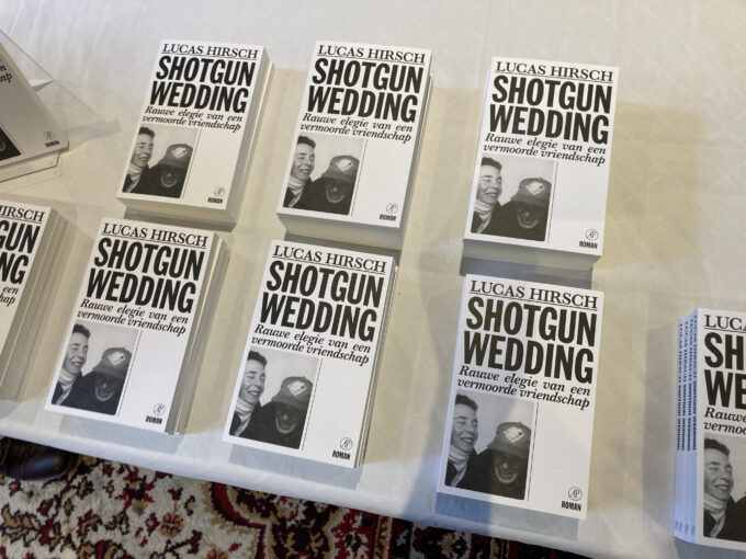
This book is about the author’s friendship with murdered lawyer Derk Wiersum. Design concept: personal memories of Derk Wiersum are overshouted by big screaming headlines in a scrapbook sort of composition.
CategoryTypography
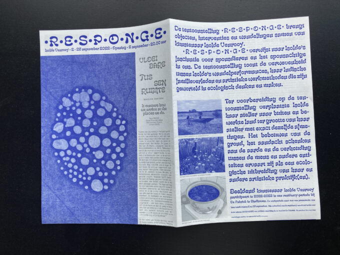
•R•E•S•P•O•N•G•E• (2022) Exhibition handout for Isolde Venrooy
A handout designed for the Isolde Venrooy solo-exhibition •R•E•S•P•O•N•G•E• in De Fabriek in Eindhoven. The text takes unexpected detours following the line of ‘between’ in order to queer directions, a connecting theme in Isolde’s work.
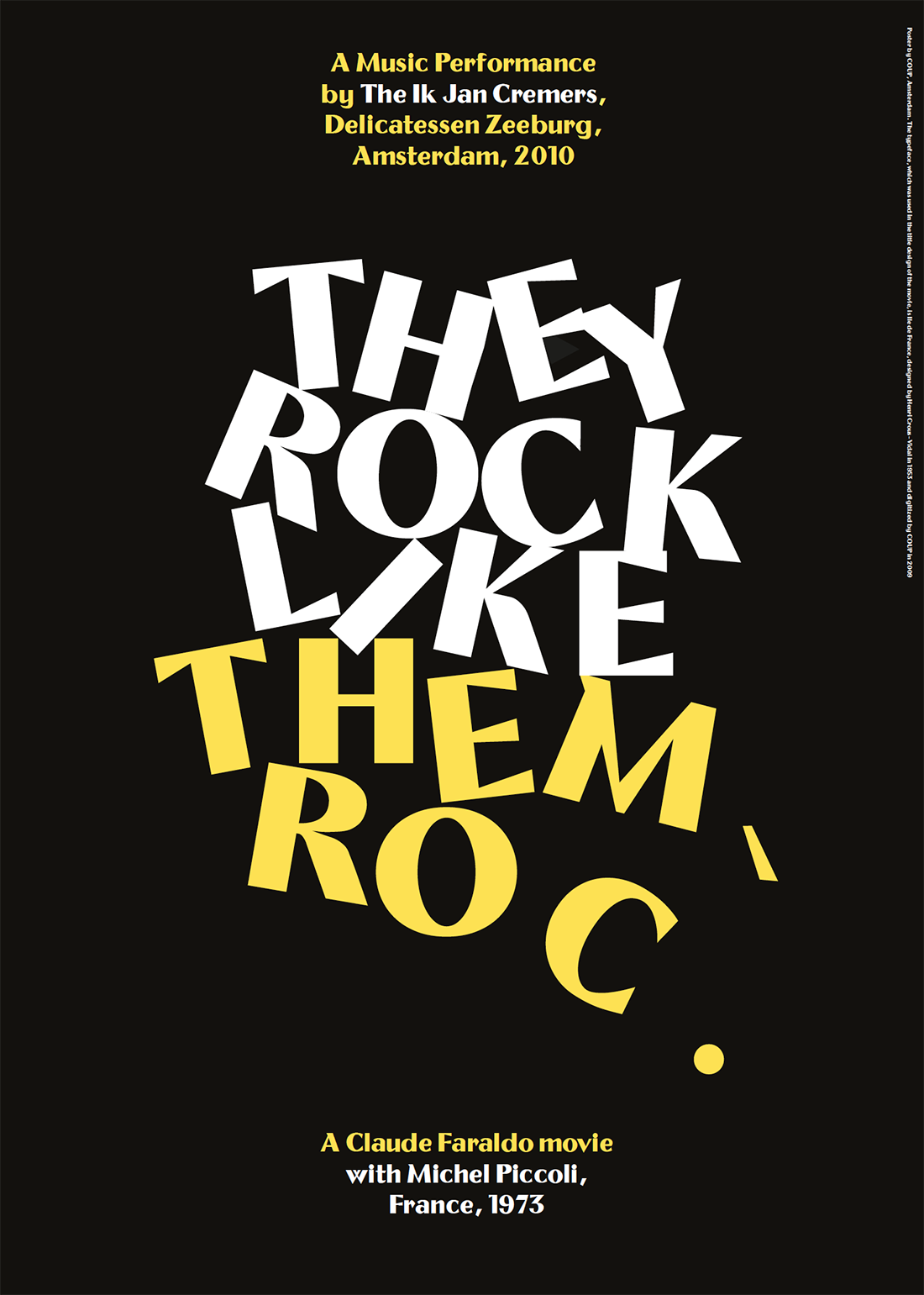
— > ‘Movie + Music’ Themroc poster for Delicatessen Zeeburg.
Copy and poster are made for an art evening, when Pop band The Ik Jan Cremers performed during the screening of the anarchistic cultmovie Themroc in which modern life is razed to the ground
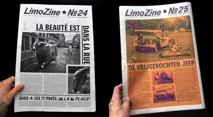
— > LimoZine 24 & 25 (2018)
The 24th edition of Limozine (written and designed by COUP) is one A3 page published in a magazine of a friend. (order here)
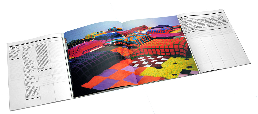
— > Book design for Stedelijk Museum Amsterdam: 3 books in 1 cover (awarded best book designs).
This book has never been online before. It is the accompanying catalogue to the exhibition Life in a Glass House, a proposal for Municipal Art Acquisitions 2001/ 2002 in the Stedelijk Museum Amsterdam
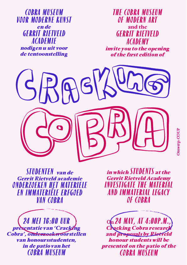
— > Flyers / brochures for Rietveld Academy workshops in the Cobra Museum.
If you dive into the archives of the Cobra Museum — like the Rietveld students did during their workshop — you can discover the inspiration for the Cracking Cobra logo.
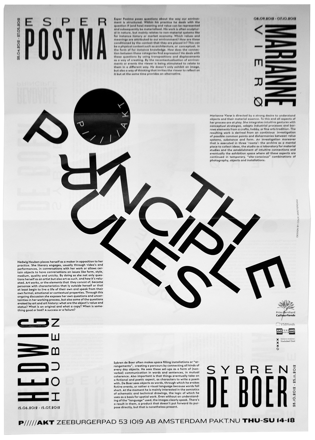
— > Flyer for Pakt: The Principle Rules.
The Principle Rules was an event about constructing and readability. The typography in the flyer and the brochure focused on readability as the result of a collapsing construction.
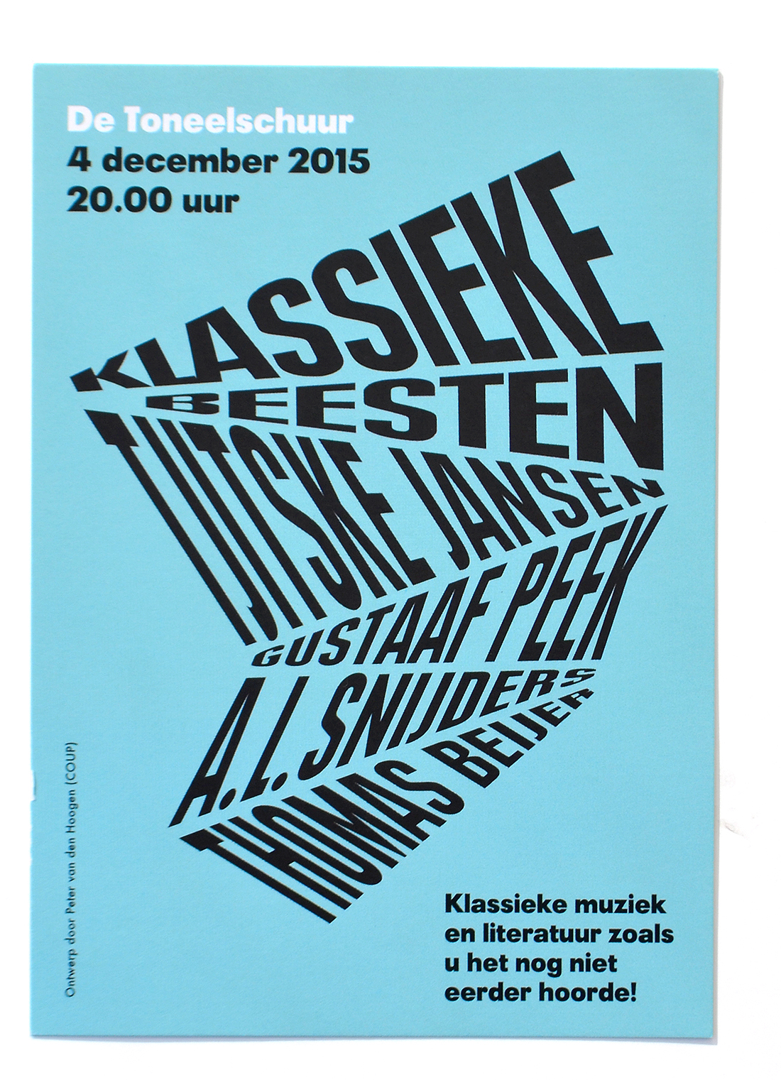
— > Poetry Out Loud posters and flyers for De Toneelschuur.
The posters and flyers are made for Klassieke Beesten, an event that could be described as a dynamic sum of poetry and music
— > Bela Lugosi’s Dead (typeface).
This typeface was born from doodles during a long phonecall with the artist Lars Eijssen. Conversations with Eijssen often inspired Peter to start making designs in the meantime.
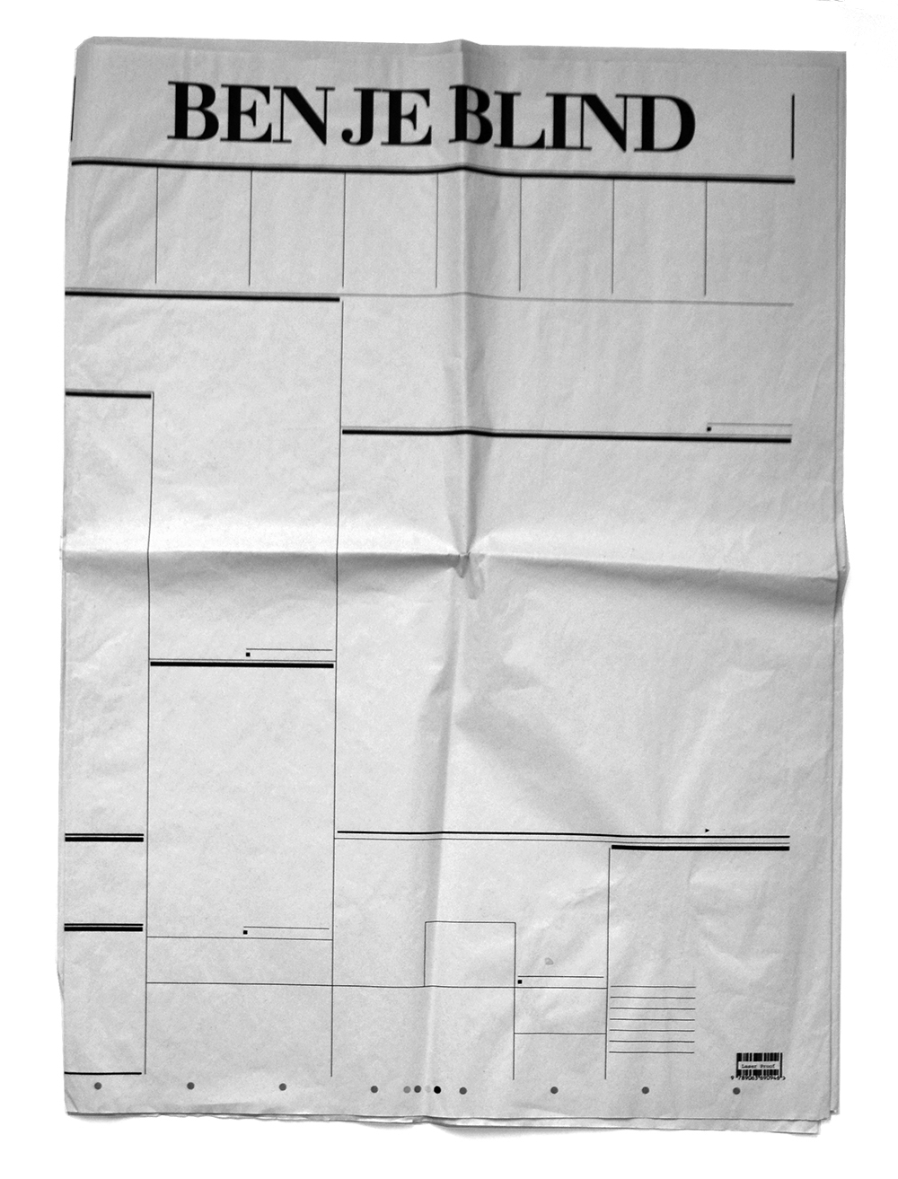
— > Blank Newspaper, part of a COUP directed political typographic TV movie for Submarine / VPRO
For every word, sentence or paragraph — written by Dutch comedian Freek de Jonge for a short political TV-movie — COUP developed a visual concept. For the phrase “Ben je blind”, a movie scene with an empty newspaper was thought up. The paper was printed at the Volkskrant in a circulation of 1 copy.