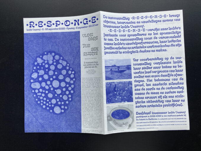
A handout designed for the Isolde Venrooy solo-exhibition •R•E•S•P•O•N•G•E• in De Fabriek in Eindhoven. The text takes unexpected detours following the line of ‘between’ in order to queer directions, a connecting theme in Isolde’s work.
CategoryBrochure
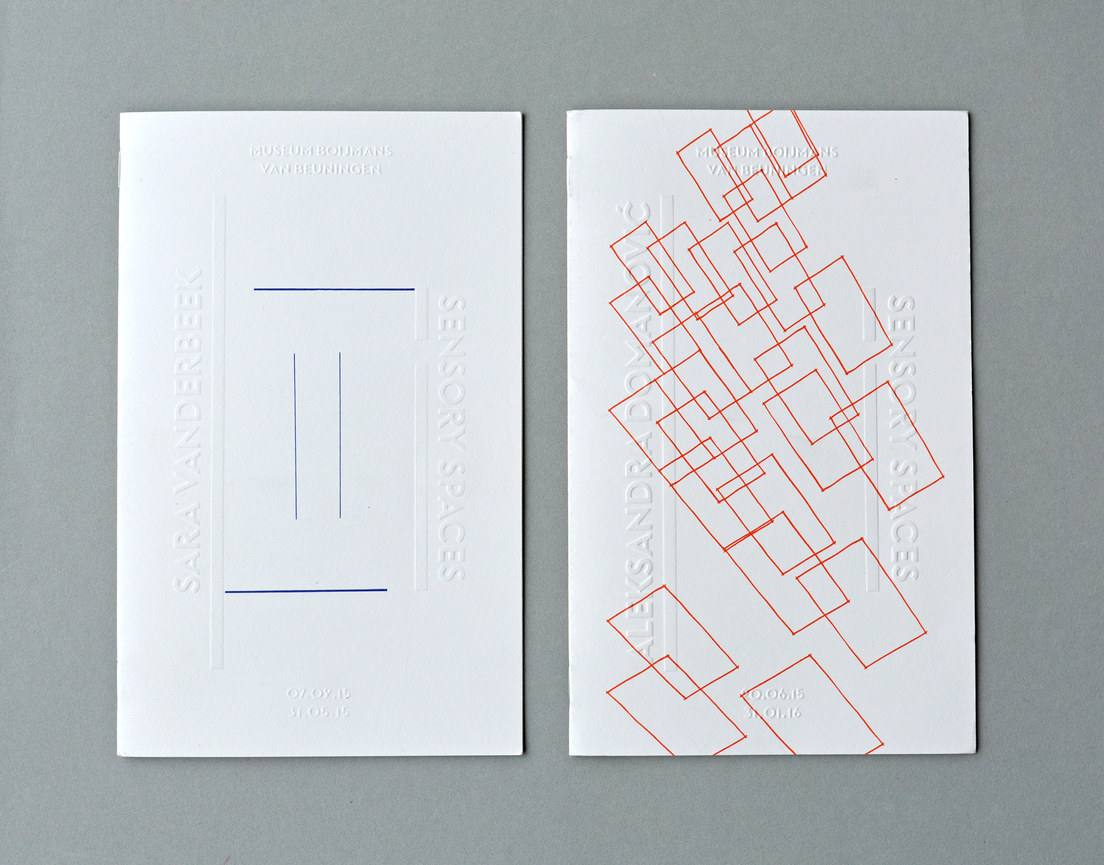
— > Brochures for Sensory Spaces in Museum Boijmans van Beuningen (2014-2019)
Design concept: The floor plan of the exhibition space functions literally as a framework for the layout. For every brochure, the participating artist is asked to sketch his or hers upcoming artwork into this framework on the cover which is printed on different weights during the series
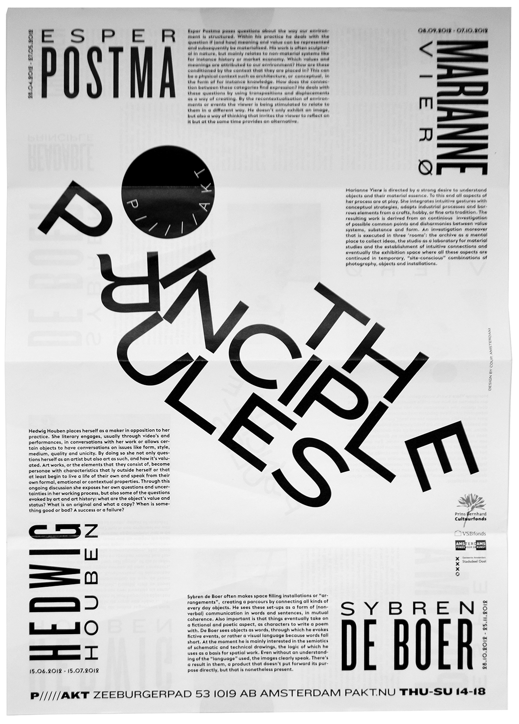
— > Flyer for Pakt: The Principle Rules.
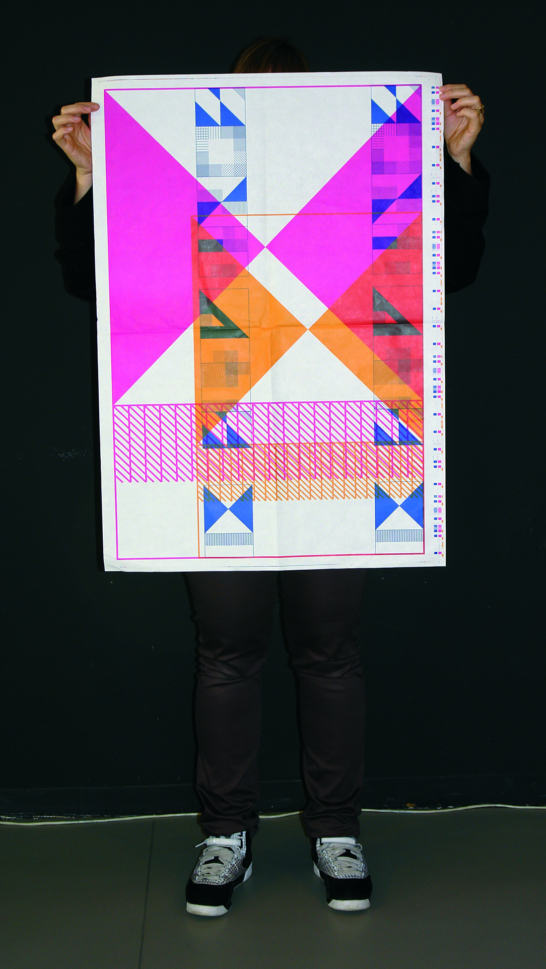
The Principle Rules was an event about constructing and readability. The typography in the flyer and the brochure focused on readability as the result of a collapsing construction.
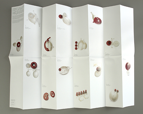
— > Jewellery brochure for Katja Prins.
Brochure for Continuum, a jewellery collection by Katja Prins about the relationship between humans, mechanic devices and (medical) technology. Typography, layout and folding are inspired by medical inserts, manuals and charts.