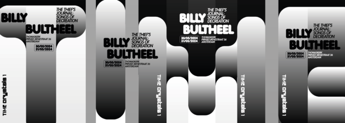
Concept:”time-based art”: a sequence of flyers and posters make up the word “Time”. Time Crystals is a time based arts program initiated and organized with curator Suzanne Wallinga. Together with a diverse range of collaborators including artists, musicians, scholars of performance art, sound artists, filmmakers, writers, and other creatives, we are crafting a dynamic live
CategoryArt
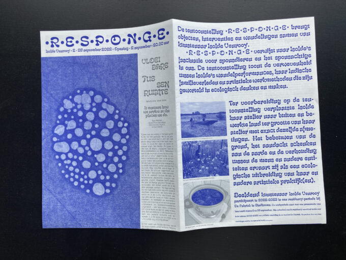
•R•E•S•P•O•N•G•E• (2022) Exhibition handout for Isolde Venrooy
A handout designed for the Isolde Venrooy solo-exhibition •R•E•S•P•O•N•G•E• in De Fabriek in Eindhoven. The text takes unexpected detours following the line of ‘between’ in order to queer directions, a connecting theme in Isolde’s work.
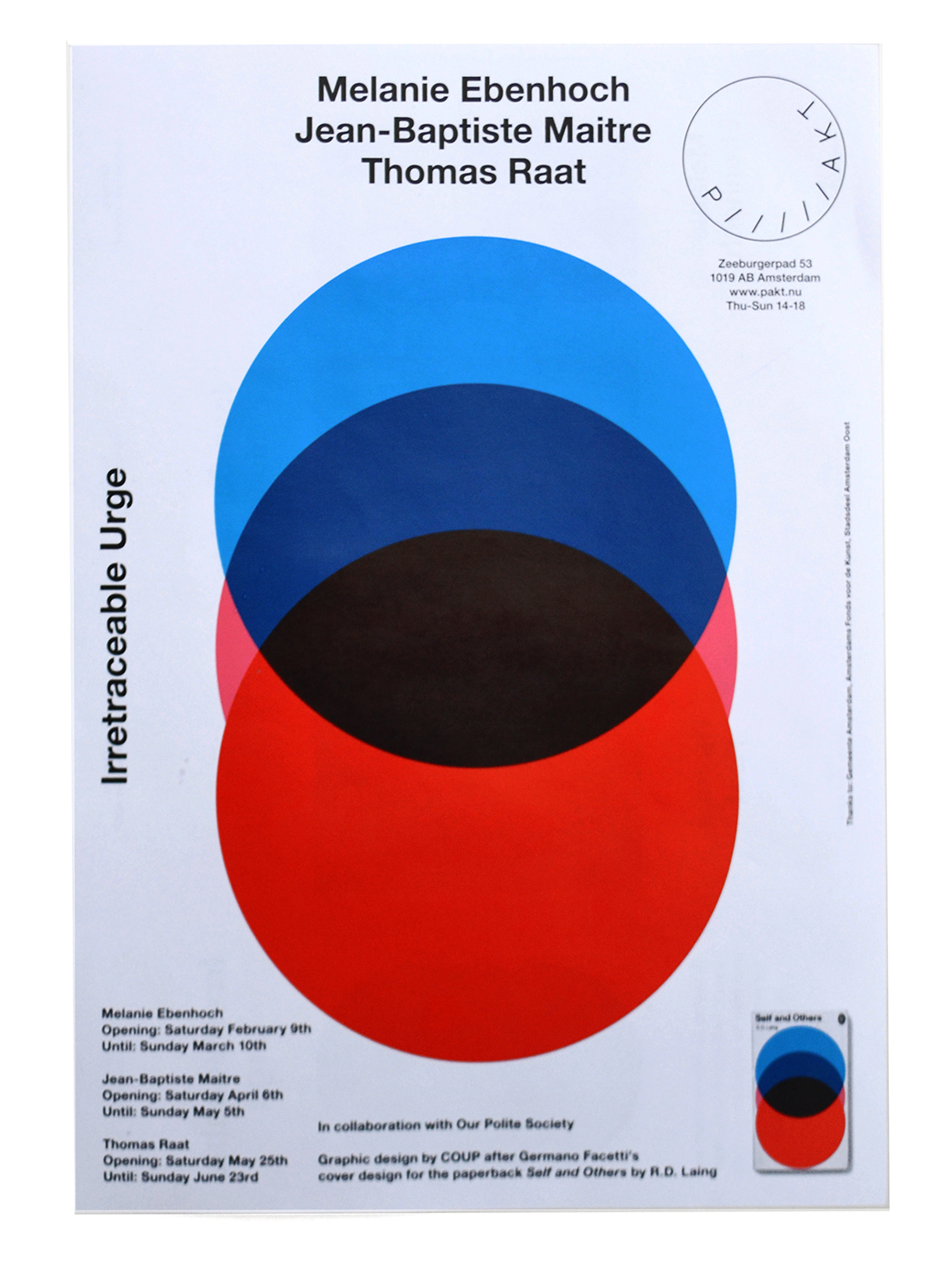
— > Flyer / poster for PAKT: The Irretraceable Urge.
In this exhibition three artists referred to applied visual language from the past. One of them, Thomas Raat, is known for copying visuals from penguin paperback covers.
— > Book design for Takako Hamano at the Sieboldhuis (Red Dot Award).
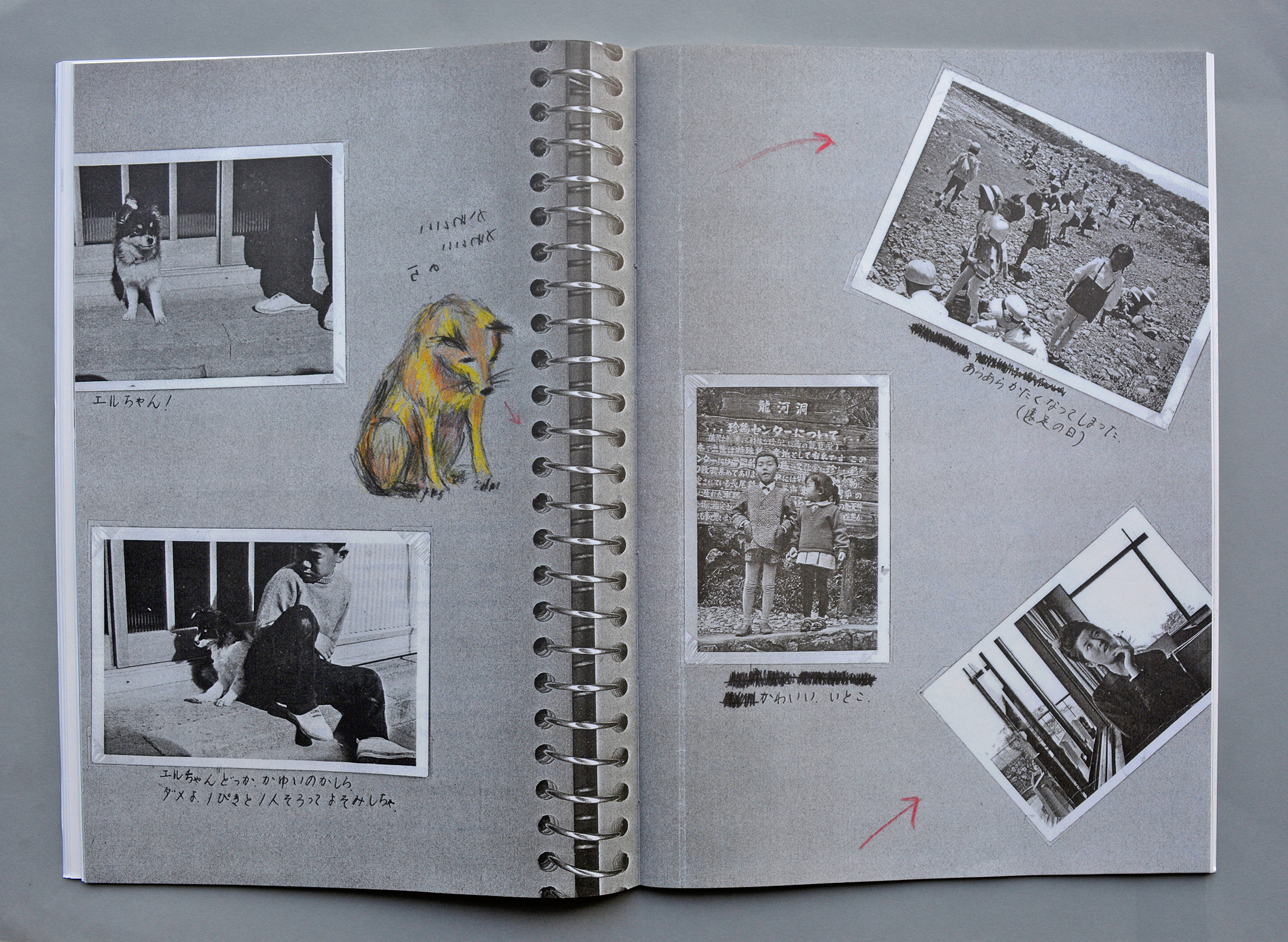
Text from the Red Dot Award jury: This book converts the texts and drawings of japanese artist Takako Hamano, who made them during her search for traces in Japanese and Dutch fishing villages, into a homogenous design.
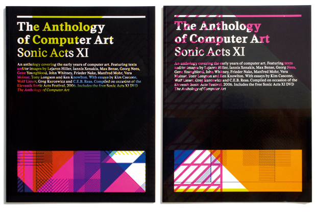
— >Publicity in different printing stages for Sonic Acts (2006) in Paradiso
Starting point was a process that would generate the design. With every printed item an extra layer was added to the printing sheet containing a zoom-out of the same design in a new pantone colour. All items have been cut in several ways from that same printing sheet, which results in different crops of the
— > Book design on Simon Starling for the Rijksmuseum Amsterdam.
This book is the documentation of a project by English artist Simon Starling in the Ateliergebouw of the Rijksmuseum in Amsterdam.
— > Book design for Stedelijk Museum Amsterdam: 3 books in 1 cover (awarded best book designs).
This book has never been online before. It is the accompanying catalogue to the exhibition Life in a Glass House, a proposal for Municipal Art Acquisitions 2001/ 2002 in the Stedelijk Museum Amsterdam
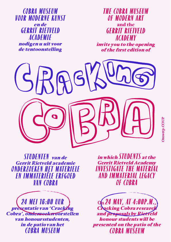
— > Flyers / brochures for Rietveld Academy workshops in the Cobra Museum.
If you dive into the archives of the Cobra Museum — like the Rietveld students did during their workshop — you can discover the inspiration for the Cracking Cobra logo.
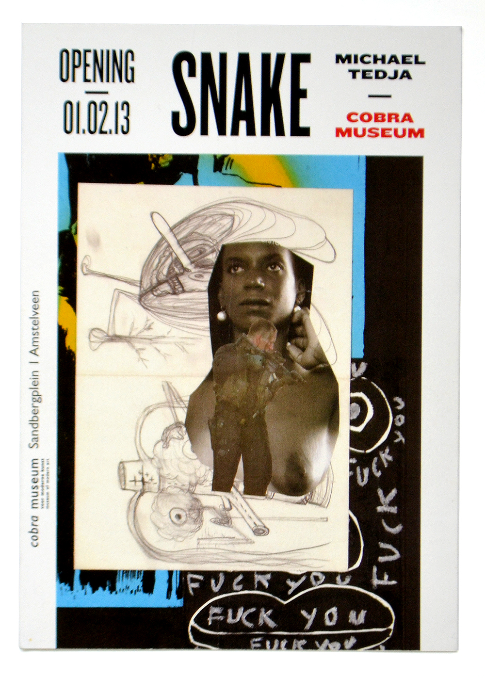
— > Flyers for Michael Tedja in the Cobra Museum.
Michael Tedja’s artworks all look very different and needed a typographic framework to make the publicity of his exhibition in the Cobra Museum look consistent
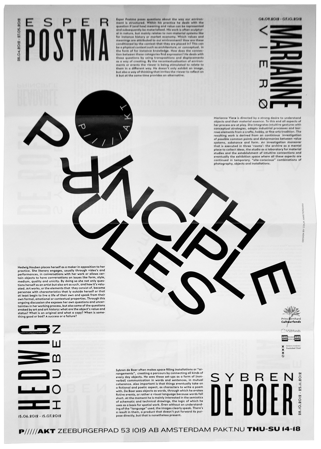
— > Flyer for Pakt: The Principle Rules.
The Principle Rules was an event about constructing and readability. The typography in the flyer and the brochure focused on readability as the result of a collapsing construction.