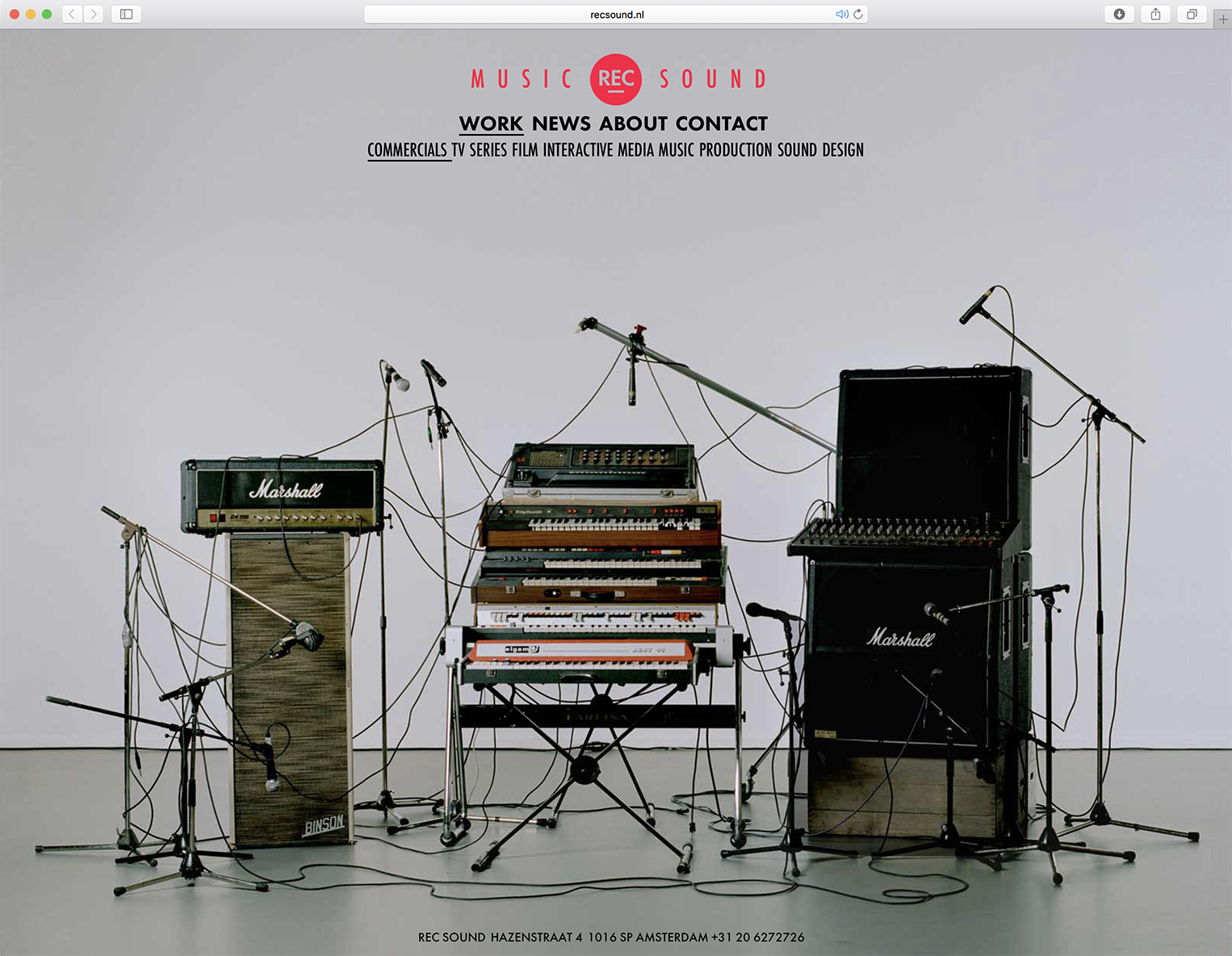
In COUP’s first identity for REC Sound, recording tapes played a crucial role. But in digital times the tapes disappeared from their studio. In the meantime more and more musical instruments entered their studio — from Toy guitars to Theremins. In collaboration with photographer Vincent Devaud.
Click Our Uploaded Portfolio
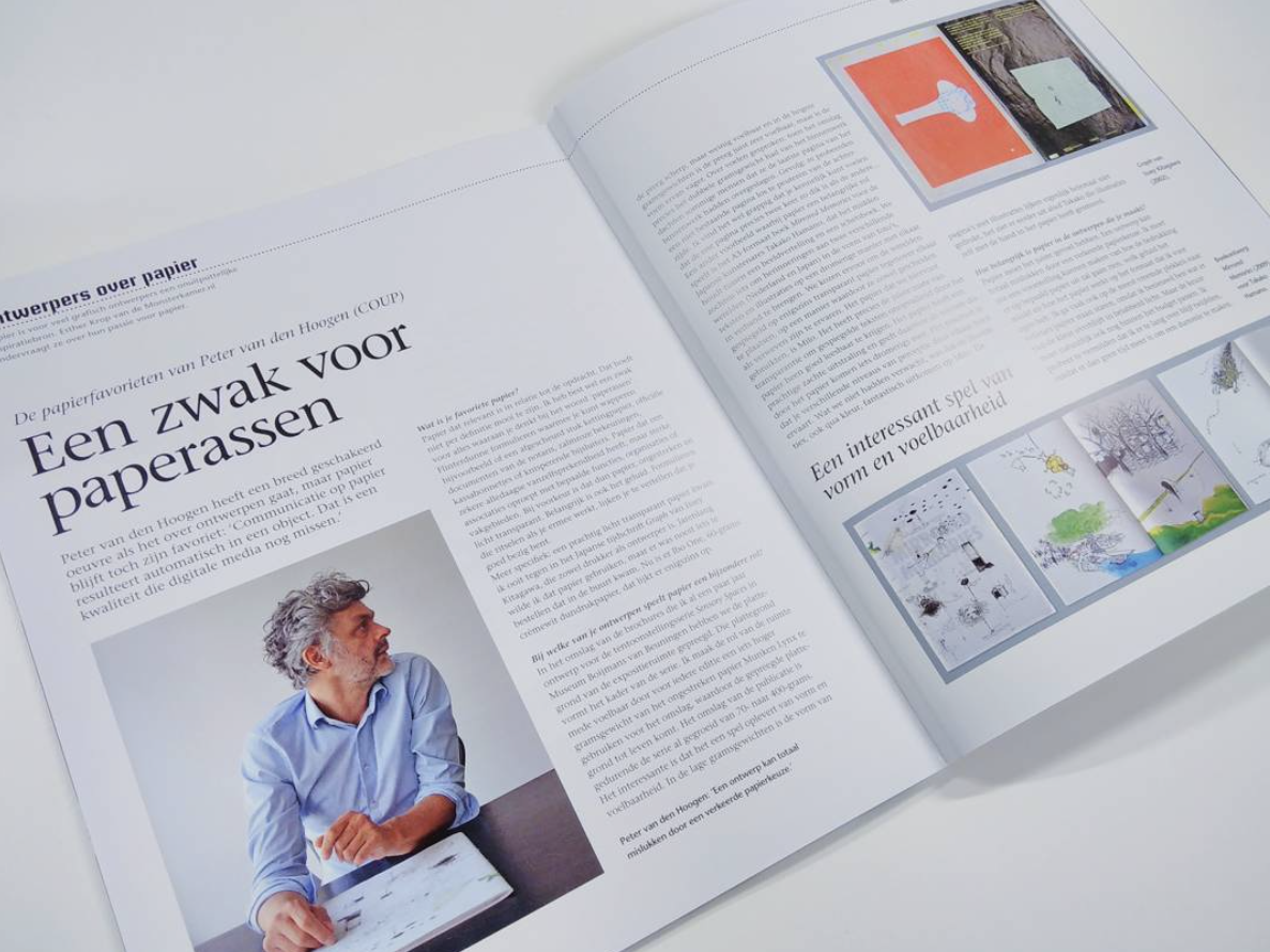
— > Interview Monsterkamer
If you are interested in paper, read the interview (in Dutch) https://www.monsterkamer.nl/2017/09/01/peter-hoogen-papier/
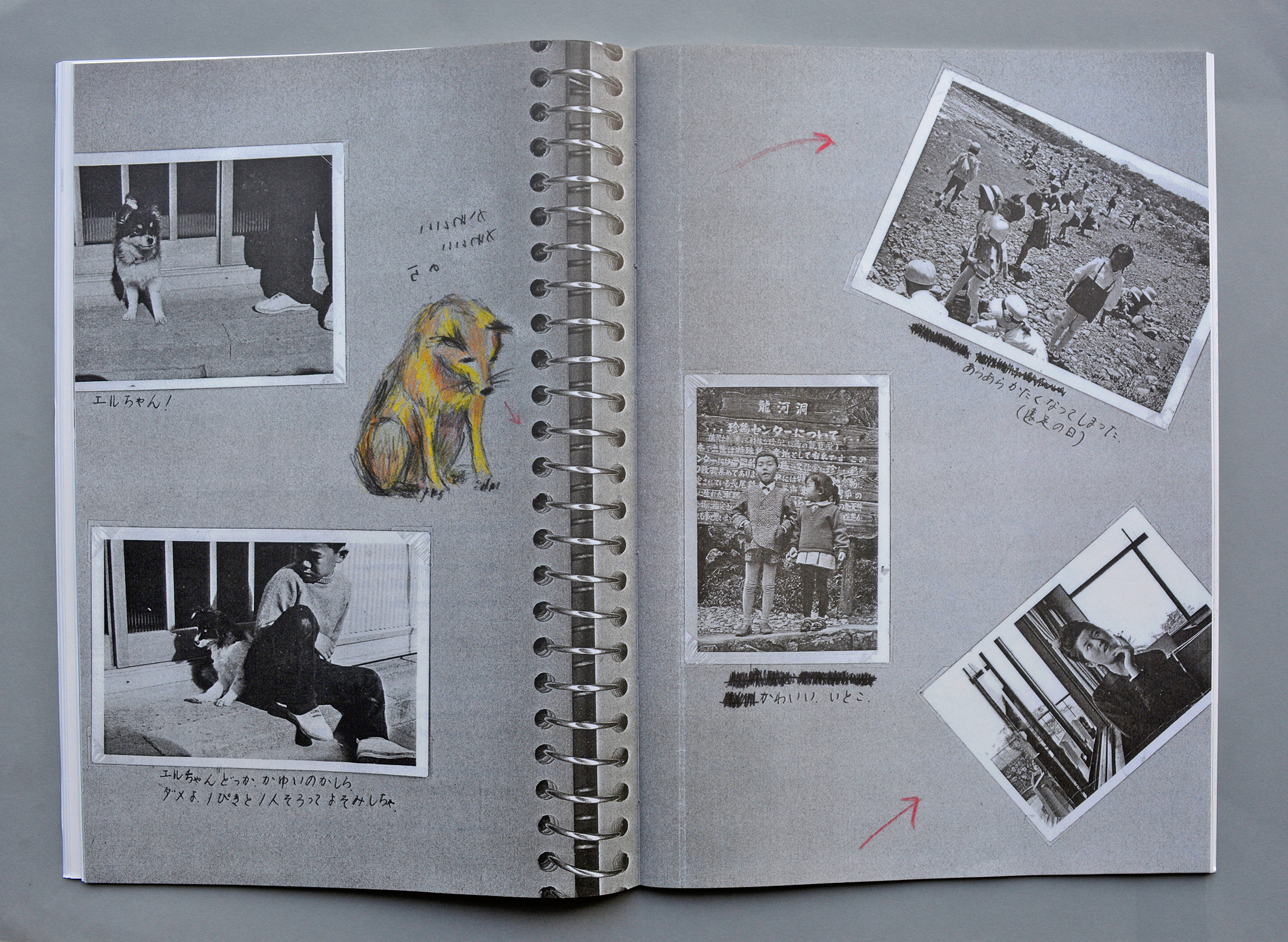
— > Book design for Takako Hamano at the Sieboldhuis (Red Dot Award).
Text from the Red Dot Award jury: This book converts the texts and drawings of japanese artist Takako Hamano, who made them during her search for traces in Japanese and Dutch fishing villages, into a homogenous design.
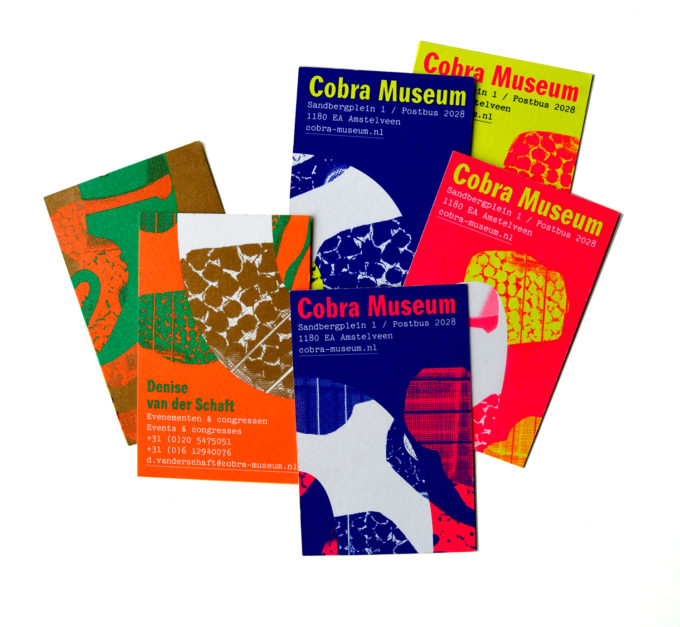
Visiting cards Cobra Museum (2018)
An assignment in collaboration with Bart de Baets, Richard Niessen and Bas Koopmans. We all constructed our own Cobra snake to cut into separate business cards. Every employee gets a piece of a snake and becomes a link in the Cobra movement.
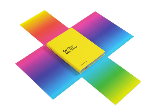
— > Listen to our typographic pop agenda for Zoo productions (2009)
The design explained in a few words: The days of the week of this agenda are replaced by words that form parts of popsongs. Together with the colour pages they reflect the hidden emotions behind the week. The Typeface is derived from Elegant Grotesk, used by Peter Saville for a New Order sleeve (Movement). Everyday life in
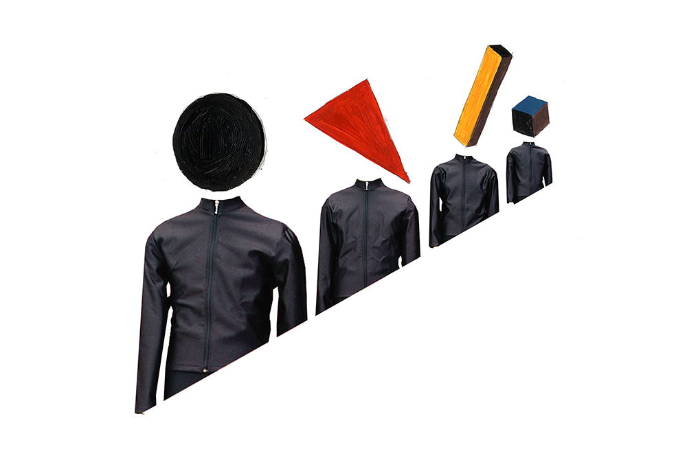
— > 3 Kraftwerk illustrations for DIY / Partynews magazine (Lausanne)
Kraftwerk portrayed as Avantgarde artists
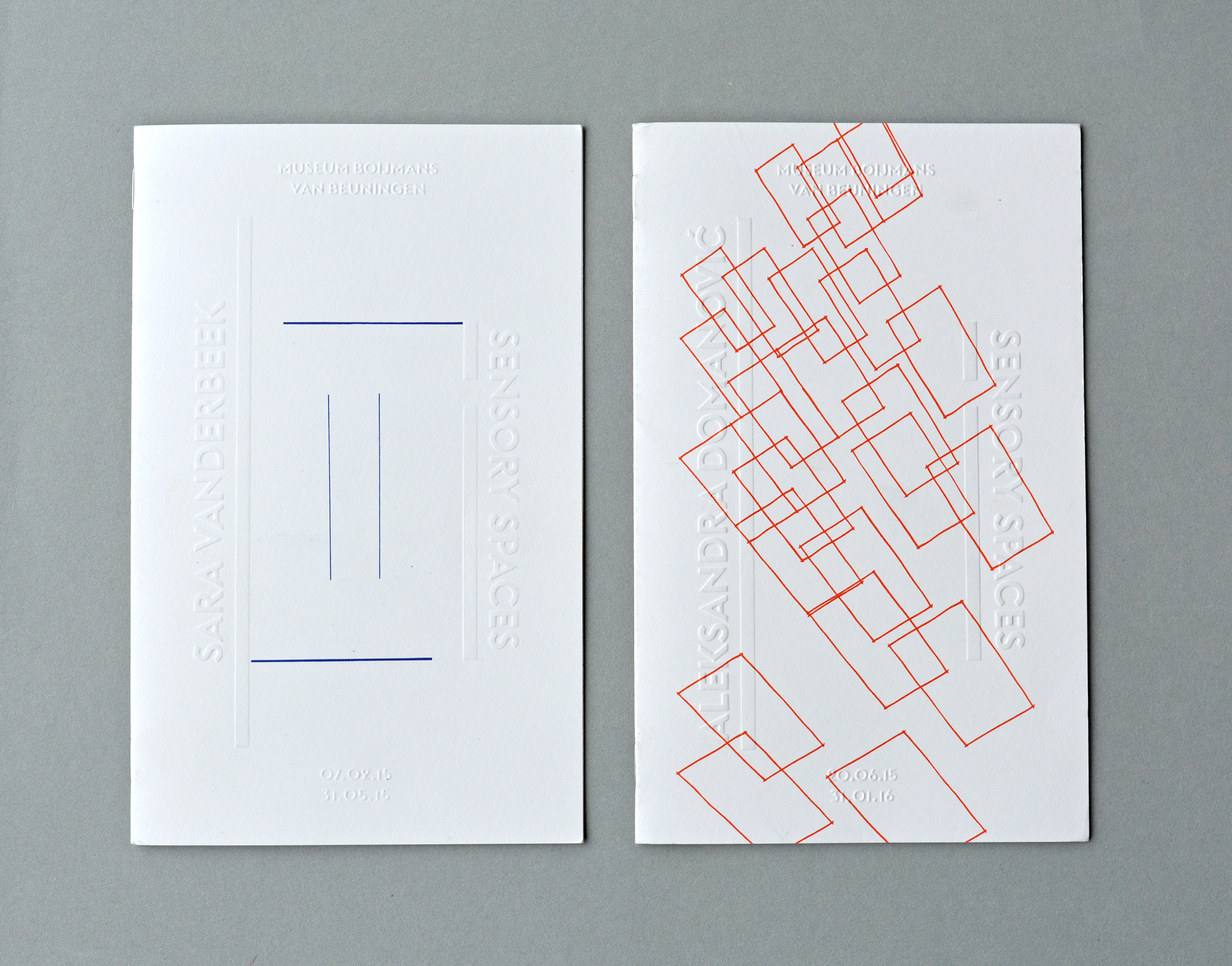
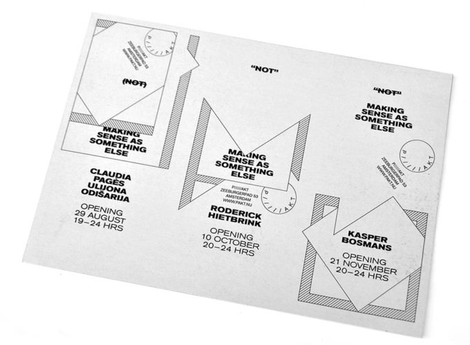
— > Brochures for Sensory Spaces in Museum Boijmans van Beuningen (2014-2019)
Design concept: The floor plan of the exhibition space functions literally as a framework for the layout. For every brochure, the participating artist is asked to sketch his or hers upcoming artwork into this framework on the cover which is printed on different weights during the series