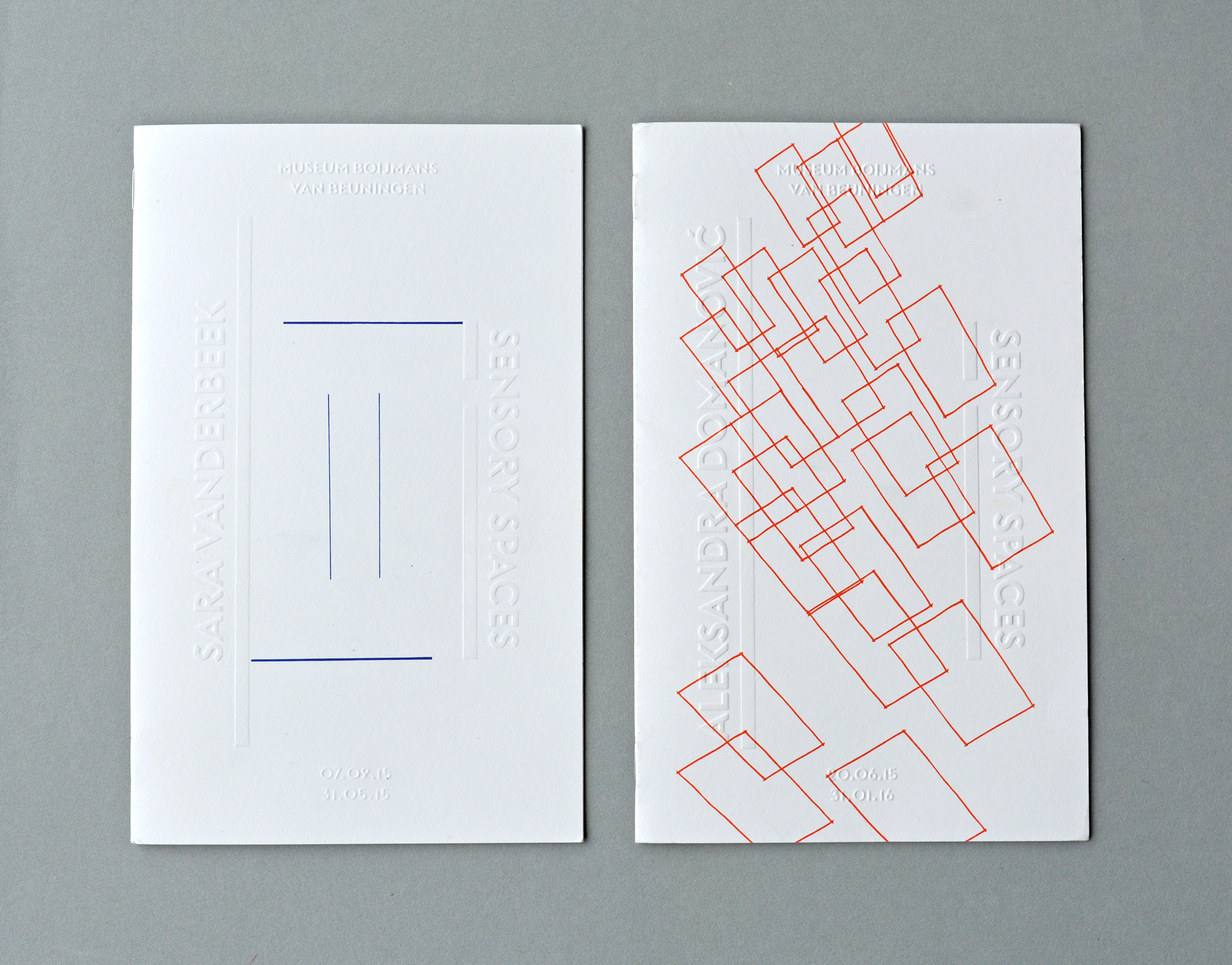
Design concept: The floor plan of the exhibition space functions literally as a framework for the layout. For every brochure, the participating artist is asked to sketch his or hers upcoming artwork into this framework on the cover which is printed on different weights during the series
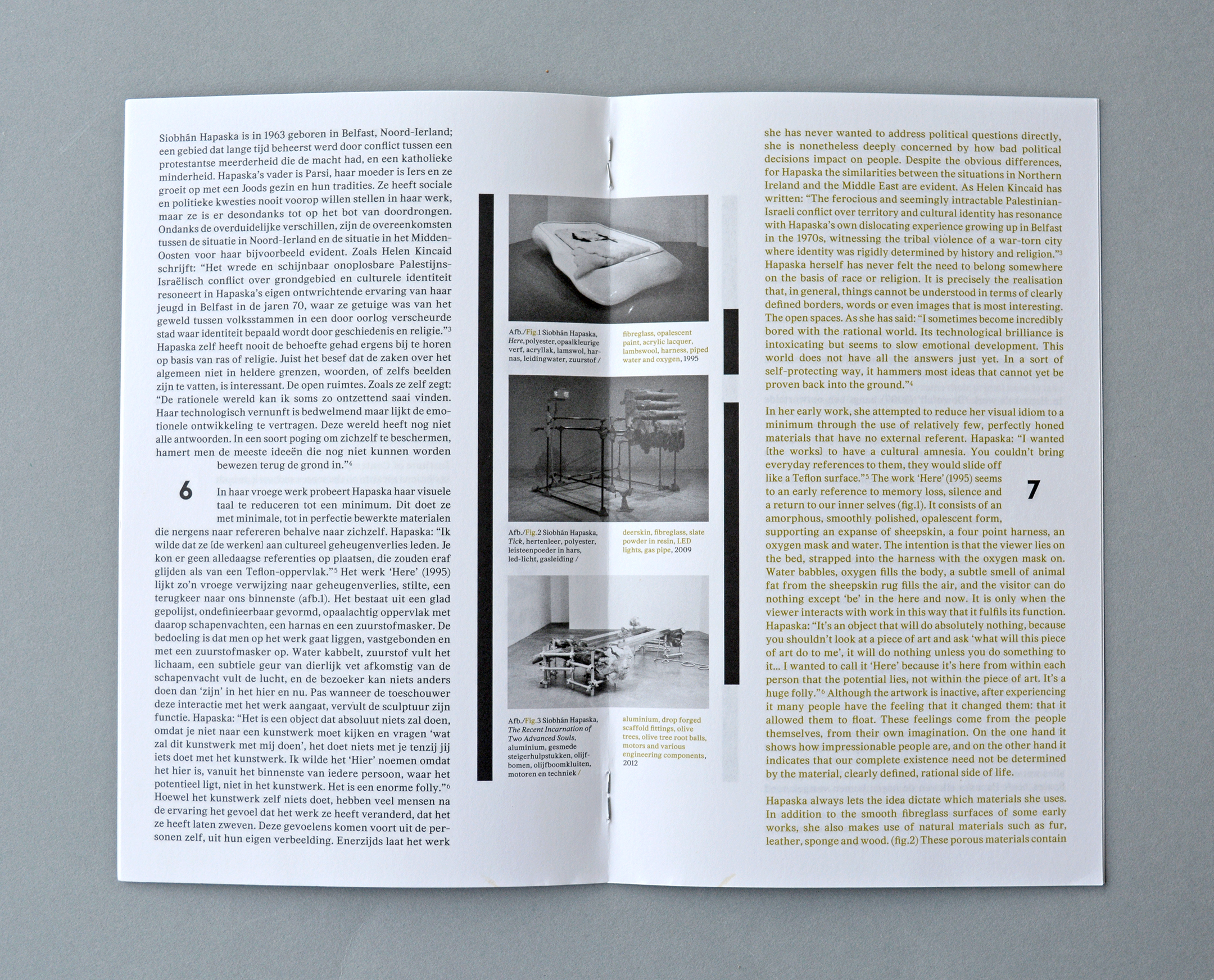
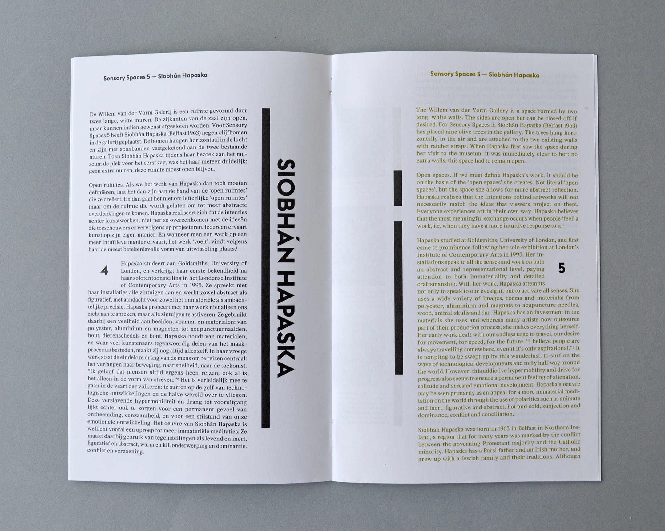
By increasing the paperweight of the cover every edition, the embossing is becoming deeper, more visible and touchable. As a result of this, it feels as if the walls and the typography are slowly growing out of the paper; the exhibition space is coming to life during Sensory Spaces. In the brochure the walls of the floorplan of the exhibition space are represented by lines, a long and a short line. The lines are shifting through a grid. The long line (on the left of the cover) is mirrored on the second page. On the third page, the position of the long line is taken by the short line. The position where the short line was on the cover, is left open on the third page.
The mirror-position of the short line from the cover is also left open on the second page. From the third page on, this system is repeated till the last page, where the transition from the cover to the inside is reversed from the inside to the back. Due to this grid, the Willem van der Vorm gallery, represented by the floorplan retains its central role in the project.
